New Layout
When creating your layout for the first time you may start from scratch or choose the starter template.
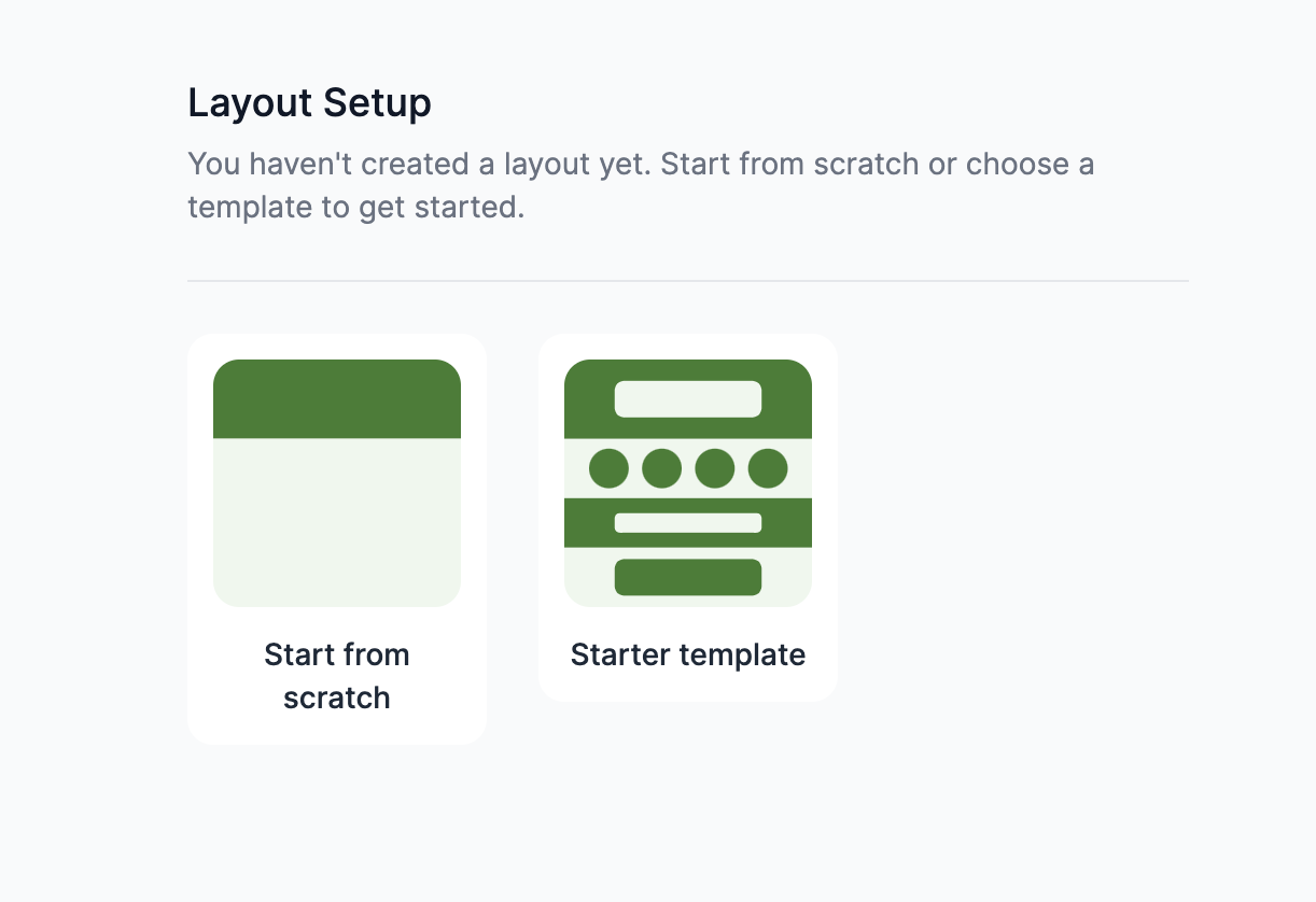
The starter template will auto populate with sections and content based on the features enabled for your event. Feel free to edit this template to better familiarize yourself with the layout tool. You can delete the entire layout at any point by selecting the "x" in the top right. This will delete all the content of your layout and present you with the option to start from scratch or the starter template once again.
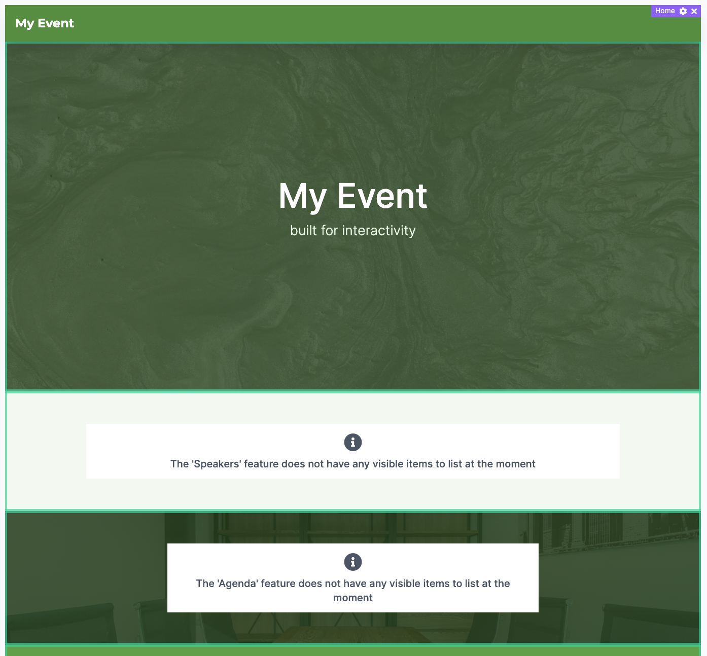
Sections, Panels, & Settings
A Web Home Layout is comprised of sections, which contain panels, and each of the sections and panels have settings which can be configured.
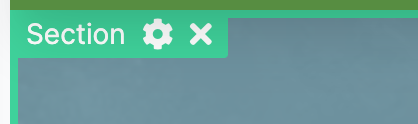
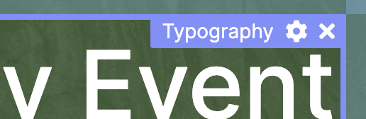
To edit a section or panel you will need to hover over the item and select the gear icon. Sections will show a green border with their label and settings accessible in the top left. Content panels will show a blue border with their label and settings accessible in the top right corner.
Edit the panel settings and click apply to see the effect. Clicking the 'Save' button in the bottom right corner of the layout page will then save your changes to the layout and make them live on the web home page of your event.
Sections:
Sections are containers for blocks of content (panels). While it is possible to move one of your feature or content panels outside of a section, it is usually best to leave them within the confines of a section. Sections allow you to add a background image or video to multiple pieces of content, as well as adjust the space to the sides & between panels.
Settings:
- Font Family: Choose from the fonts listed to have them applied to any text housed within the section
- Item Spacing: Used to add space between the content of your section
- Edge Spacing: Used to add space around the outside of all content housed within a section.
- Background Color: Use the color picker or hexadecimal input to select a color and transparency for the section. With transparency it can be used to overlay on top of a background image or video.
- Background Media: This may be an image (png, jpg) or video (mp4).
Panels:
Panels are what is used to display content. Panels can be added by creating a new section and selecting the "AddPanel" button within it.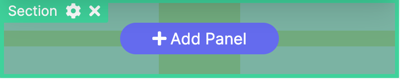
Panels can also be added before or after existing panels. Select the existing panel and use the + button to add a panel before or after the selected piece of content.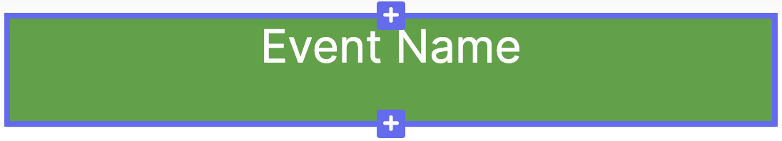
When creating a new panel you can choose from the following types of content:
- Typography - Directly editable lines of text
- Feature List - Display a list of items from a given Feature
- Feature Item - Display the details of a Feature item
- Page - A special Feature with hand tailored content, editable using a WYSIWYG editor
- Image or Video - Display images or videos
- Section - See sections above, can be nested
- Select a Feature: Select the feature from the dropdown to choose which content you'd like displayed in your Feature List or Feature Item Panel
- Label: This label sits above Feature panels and defaults to the feature name. Deleting the label will remove it from appearing in the layout.
- List Count: Display the first X number of items when using a Feature List panel.
- List Style: Choose list to display all items, cycle will display each item one at a time
- List Direction: Display list items on top of each other or side by side
- Feature Style: Compact for minimal information, Expanded for more detailed information
- Hide Background: Useful when you hav a background image or video
- Theme Color: Used for themed content within panels
- Background Color: Use the color picker or hexadecimal input to select a color and transparency for the panel.
- Background Media: Upload png, jpg, or mp4 videos to appear behind the content (Background color appears on top of background media)
Comments
0 comments
Please sign in to leave a comment.